
Seaside Tutorial
Software Architecture Group
4 - Components
As we have already said, Seaside's way of creating Web applications is different from most other Web frameworks. Seaside adopts a component-based approach to tie different objects and their contents together and generate a single Web page from them. That way, web interfaces can be constructed as a hierarchical tree of stateful objects. To clarify this, imagine a simple standard Web page: usually, there is some kind of navigation means, a menu, and another part of the page contains the real contents corresponding to the particular menu items. This resembles a very simple component structure. The root component represents the visible page as a whole. If you put all your rendering code into this single component you would flinch at the immense complexity: there would be a massive amount of code pertaining to all kinds of different aspects, but no clear structure.
Components are a way to semantically divide your page into parts. Obviously, the navigation menu is one such part. Everything that belongs to it goes into our new menu component. Furthermore, the menu component instance can contain information about its current state. That is, you can safely store the currently activated menu item in it. The reason for this is that each user's session data can be stored in dedicated component instances this way. Sessions and the pertaining component instances are entirely managed by Seaside. Your root component only has to inform Seaside that menu component is its child and render it in the right place.
The currently shown page, corresponding to the last selected menu item, is another component. The component paradigm does not stop here: a page can contain forms, lists and other standard elements. These can be components, too. For example, a subscription form or login field can be written as components and therefore be reused later on in other applications. Seaside even provides many standard components, for example a simple time selector or a mini calendar (date picker).
As you can see, it is easy to construct a system from different collaborating components. In fact, this approach is similar to approaches adopted in assembling usual desktop applications, where reuse also is an important goal. With Seaside you are able to easily create reusable components whose appearance can be controlled via CSS.
Now let us go back to our evolving ToDo Application. So far, we have created model classes for representing users and tasks, and a simple component, which we have called StRootComponent. It will serve as the root of our component structure. As a first step, we would want to have two other components: a menu where we can choose whether we want to see pending or completed tasks, and a component that presents a corresponding list. So, create two empty subclasses of WAComponent named StMenuComponent and StListComponent. To get some visible results, we start with changing the rendering in our root component to something more valuable:
But where do the menuComponent and listComponent come from? They do not exist yet. So, add them to the instance variables of the class StRootComponent and create the accessor methods for them. These variables also have to be initialized:
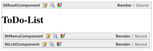
Here, it is very important to call the #initialize method of our super class WAComponent because it is required for various data initialization purposes. If you render our Web page in your browser now, you get an almost empty page: only the headline is displayed. But you can see the sub components with enabled halos (figure 4.1). The reason is, of course, that we do not render anything in our subcomponents yet. Therefore, let us fill them with some content:
This little piece of code does not do anything really useful, it just prepares us for the next level. It creates a simple anchor with the title Menu entry on our page. The #callback: message applies a block to our anchor, which will be evaluated as the user clicks on the link. We leave this empty for now.
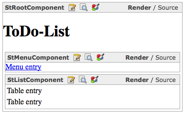
Again, this is just a simple snippet showing you how to create a basic table. You can see that you do not need to write HTML code to create a table structure. You will see how to beautify it via CSS in one of the next chapters. If you look at your Web page now (figure 4.2 shows it with some style sheets added), you will see that our components have rendered the content as intended. But if you click on the link, an error shows up, although nothing should happen! The reason is that our root component knows its subcomponents, but we did not tell Seaside about them. For this, you need to override the #children method and return an array containing all our child components.
Before we get our real business data into our components, we have to dig into another lesson...
Component reuse is a worthwhile goal, though sometimes hard to achieve. It can consume much time better spent on your application rather than perfectionism. However, if your applications are getting larger, the time will come when you have to refactor the code and merge similar components into one. This will result in more useful components, perhaps reusable in more than one or two of your Seaside applications.
For now, let us assume our tutorial menu component has to be reused in other places. This means that we cannot simply enter our menu entries into the source code of the component but instead make it configurable. So we need something like StMenuComponent>>#addMenuEntry:. As the action to execute upon clicking the link is unknown to the menu component, too, it has to be passed as a block side by side with the name of the link. This may sound like a dictionary where we map a title to its action, but that is unfortunately not fully correct, since a dictionary is unordered, so you will never know in which order the inserted data are stored. Instead, we will use an OrderedCollection which contains Associations. Please create an instance variable named entries and some accessor methods in our StMenuComponent and initialize it with an empty OrderedCollection. Remember to call #super initalize if you implement that in the #initialize method. Now we can continue with the method for adding entries:
That was pretty easy. As these entries will not be rendered yet; we have to change our simplistic #renderContentOn: implementation. An entry is an association between a string and a block, with the message #key at #with: we add the string as output text and with #value we return (not execute) the block and connect it to the #callback: method.
Now we have a reusable menu component. We could add some CSS classes
to be able to configure the design via style sheets, but this will be
covered in one of the next chapters. Of course, you want to see some
results now, therefore we refactor
StRootComponent>>#initialize to call self initializeMenuComponent instead of simply initializing themenuComponent instance variable. #initializeMenuComponent then will look like this, although we are not filling in actions because our list component is not ready yet:

In figure 4.3 you can see a simple list of menu entries (HTML Code) beneath the headline. Additionally you can see that Seaside have generated all links automatically and the developer doesn't need to know which link triggers which piece of code (callback). So, let us move on to our list component. Assume there is a need to make this one reusable, too. How can we do this? It shall show us a list of to-do entries, therefore we have to supply it with this list. However, not every list item should always be displayed and furthermore they have to be sorted in different ways. This means that a filter and a sort block are needed. Additionally, the list components should consist of arbitrary types of items. The problem with this is that the component cannot decide how an item is rendered. As Seaside supports the separation of model and view, the StTask must also not know its appearance. Therefore, we need a renderItem block, which specifies how to render the given item. Please create the four instance variables items filterBlock sortBlock renderItemBlock and their accessors in the StListComponent class. Afterwards we can alter the #renderContentOn: method:
As you can see, this method first sends the items through the set filter and afterwards through a sort block. For each remaining item a table row is created and the renderItemBlock is evaluated with the item and the current renderer as parameters. The block should use the delivered html object to render the item data into the table rows.
Now the first version of our list component is ready to render a filtered and sorted list of items. However, be aware that the two components presented here are designed for reusability. You most certainly would not implement them like this for an application as simple as ours if you did not want to support reuse.
To finish this chapter, we want to get our little component structure to work as expected. First, the correct initialization of our list component is needed. So, as done before, take out the assignment to the listComponent instance variable from the StRootComponent>>#initialize and instead call this new method from there:
This code snippet sets a simple sort block after the list component is instantiated. In the next line the renderItemBlock is set, which calls a #render method on self. So the StRootComponent knows what a task looks like. Afterwards it sets the currently shown filter to display only the pending tasks. The method StRootComponent>>#showPendingTasks is one of four methods which just set the corresponding filter in the list component:
We are almost done. Of course it is necessary to call the methods defined above. We already were at that point when we finished the menu component. Go into the StRootComponent>>#initializeMenuComponent and adapt the actions for the menu entries, which were previously empty, to the following:
If you cannot resist to try the Web page now, you will surely get an error. You might already know the last missing method: StRootComponent>>#renderTask:asRowOn:. At the moment, we will try to keep it very simple and therefore just put date, name and description of our task into the table row:
But wait! Again, something is missing. Although everything works now,
we do not have any data to present. Because input forms and database
are covered in later chapters, by now we will only create some test
data. Append the line self listComponent items: self testTasks
to the method StRootComponent>>#initializeListComponent. Afterwards
create the just used method:
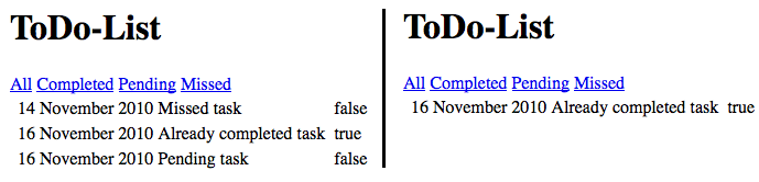
In figure 4.4 you can see the final root component. In the left part all tasks are shown and in the right part the user has clicked on the completed link to show only the corresponding tasks.