| Version 6 (modified by , 13 years ago) ( diff ) |
|---|

Introduction
Adds nice looking Morphic controls, e.g., lists, dropdown lists, push buttons, check boxes. It uses the signals mechanism for callbacks.
How to Install
| Environment | |
 | 4.1, 4.2 Trunk |
 | 4.0.2 (win) |
 | not tested with cog |
| Sources | |
 | ConfigurationOfWidgets |
 | SwaUtilities |
 | Widgets |
| | Icons (optional) |
 | Signals |
| | Animations |
| | SwaUtil |
| Misc | |
 | SwaUtilities@SqueakSource |
Configuration groups
default ... just the widgets
full ... widgets and several CC icon sets (~10000 icons)
System categories
Widgets-Core ... various widgets (e.g., buttons, lists, line inputs)
Widgets-Support ... internally used helper classes
Widgets-Views ... model-based item views (list, table, tree with columns)
Widgets-Views-Models ... example models also used in default dialogs
Widgets-Views-Support ... internally used helper classes for item views
Widgets-Dialogs ... default dialogs, ui files created with Morphic Designer
Version 1.1 (in development)
- improved item-based and model-based views
- to be used in Morphic Designer 1.1
Version 1.0
- first release to be used in Morphic Designer 1.0
- still dependent from swautil due to text formatting functions
- will be removed soon as lots of other stuff comes with that package
- some example dialogs need the Icons package
How to Use
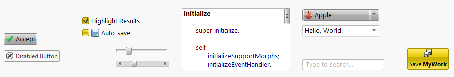
Buttons
Common Properties
| Selector | Type | Description |
autoExclusive | Boolean | only one of these in the owner is checked at a time |
checkable | Boolean | determines whether it can be checked or not
|
checked | Boolean | button remains in a visual down state if true |
enabled | Boolean | controls (mouse) input in general |
icon | Form | appearance depends on the button type |
text | String or Text | text written on the button |
Push Button

A push button is the most known and used button type. It is often used for OK and Cancel operations in a dialog.
Tool Button

| Selector | Type | Description |
autoRaise | Boolean | raises only on mouse hover if true |
buttonStyle | Symbol | determines the layout and usage of icon and text
|
A tool button can be found in tool bars or other places that want to offer functionality in the GUI without having a too much present push button there as the tool button is smaller in general.
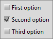
Check Box

A check box is a checkable button by default with a slightly different appearance as a small button-like square is in front of the text/icon.
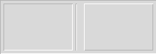
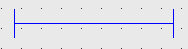
Containers & Spacers
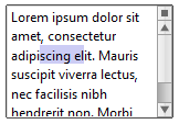
Input Widgets
Display Widgets
Item Widgets (Item-Based)
Item Widgets (Model-Based)
How to Extend
Most of the widgets are written from scratch. If you want to extend or add new ones, here are some hints:
- layouting of morphs in combination with embedded text morphs can be problematic in the first place as the dimensions are not correct
- see optimizations and fixes in
UiComboBox
- see optimizations and fixes in
- put all signals of a widget class into the signals protocol
- for each signal, explain with a comment when it will generally be sent, e.g., "This signal is emitted whenever the user clicks with the left mouse button."
- try to write as compact classes as possible, i.e., avoid having several classes for buttons, buttons with icons, buttons with icons and text, but write exactly one class and make these features configurable
- consider the Morphic Designer and implement on the class-side of your widget class:
#isWidgetClass... used by the designer as a widget#widgetCategory... as grouped in the designer's widget tree#widgetProperties... appended to the end of the designer's property table#widgetPropertiesToIgnore... hidden in the designer's property table#widgetClassIcon... icon in the designer's widget tree#widgetClassName... text in the designer's widget tree
Attachments (12)
- widgetsbanner.PNG (10.7 KB ) - added by 13 years ago.
- pushbutton.png (1.3 KB ) - added by 13 years ago.
- checkbox.png (754 bytes ) - added by 13 years ago.
- toolbutton.png (819 bytes ) - added by 13 years ago.
- buttongroup2.png (1.4 KB ) - added by 13 years ago.
- container.png (864 bytes ) - added by 13 years ago.
- spacer.png (562 bytes ) - added by 13 years ago.
- textedit.png (3.2 KB ) - added by 13 years ago.
- lineedit.png (541 bytes ) - added by 13 years ago.
- combobox.png (6.8 KB ) - added by 13 years ago.
- itemview.PNG (130.3 KB ) - added by 12 years ago.
- allwidgets.PNG (19.0 KB ) - added by 12 years ago.
Download all attachments as: .zip